A cover built around contradiction
The cover of Biolamp turns the collection’s central tension into an image: nature is lush and uncanny at once, and a lone figure stands inside a world altered by loss. Dennis James Sweeney’s second poetry collection, due April 20, 2027, from Autumn House Press, considers ecological collapse, digital disconnection and the past embedded in present-day surroundings. Those themes could easily become a list of anxieties; the image gives them a shared visual language instead. Its flowers offer signs of life, but their abundance doesn’t erase the unease surrounding the figure. The poems find a reason to keep imagining in the act of feeling, even when that feeling is grief or dread.
Electric Literature is revealing the cover ahead of publication. Biolamp is available for pre-order here. The image serves as an early introduction to a book whose concerns are broad, but whose approach appears grounded in intimate perception: a person looking out at a changed world, and trying to make sense of what remains.
A collage shaped by the book
The cover brings together art by Minnesota-based collage artist Connor “Phib” Dainty and design by Mike Corrao. Sweeney had admired Dainty’s work for years, particularly its remixed vintage nature imagery and surreal scenes of people moving through transformed environments. That visual language sits close to the poems’ moods, where the natural world can feel beautiful without offering reassurance. This is more significant than it looks: a cover that holds beauty and estrangement together can prepare readers for a collection that doesn’t treat hope as a simple answer to loss.
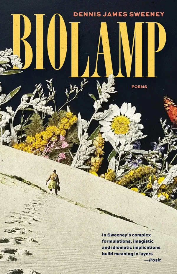
Sweeney first asked editor Christine Stroud of Autumn House Press about using an image of a rainbow monolith being photographed by a small black-and-white man. Stroud contacted Dainty, who agreed to let the press consider his work, and then suggested other collages from his collection. Corrao developed several of those into cover mock-ups, turning the selection into a conversation among the artist’s existing images, the book’s themes and the practical demands of a cover. That process matters because an image can change when it’s asked to introduce a specific work. It’s no longer only a composition to look at; it’s also a promise about the reading experience.
The chosen image wasn’t the one Sweeney had initially gravitated toward. Seeing it in Corrao’s design changed his response: a standalone artwork, he found, carries a different meaning once it becomes a book cover. The finished image’s dark, flowering forms suggest ghostliness and vitality at the same time. The ocean that recurs in the poems seems to wait beyond the horizon, holding both overwhelm and relief. A threshold, then, rather than a scene with a settled interpretation.
Typography becomes part of the scene
For Corrao, the challenge was fitting the title and author’s name into existing artwork without breaking its mood. Dainty’s composition offered open space at the top and bottom, allowing the text to sit naturally rather than compete with the central image. Corrao added speckled paper textures and threaded the lettering through pale foliage, treating typography as another element of the collage. The design choice makes the words feel embedded in the world they name, instead of laid over it after the fact. Small decisions like that can shape how a reader approaches an image before opening the book.
That treatment echoes the collection’s interest in connecting the natural world with written language. Corrao saw a productive tension between earthly plants and a lunar, tundra-like setting, with a lone figure drawing the eye into the surreal forest. The setting doesn’t resolve into a recognizable place, and that uncertainty suits poems concerned with ecological change and disconnection. If you’re working in this space, the cover’s careful balance offers a useful reminder: visual atmosphere can carry an idea without turning it into a caption. The result, Corrao says, felt well matched to Sweeney’s poems.
What collaboration brings into view
Sweeney also sees the cover process as part of writing itself. Conversations among an author, editor, artist and designer can expose meanings the writer hadn’t recognized while working alone; here, the finished cover helped him see a hunger beneath the poems’ lushness. Its small figure and flowers suggest a passage from one self to another, toward whatever lies beyond the horizon. That reading doesn’t pin the poems to a single message. Instead, it gives the image room to hold competing feelings, much as the book’s natural imagery seems to hold beauty alongside damage.
And this is the part most people overlook: collaboration can change how an author understands a work after it’s written. The cover isn’t simply a summary of the poems’ subjects, because it brings its own associations and questions to the encounter. A figure facing an unseen ocean invites the reader to consider what might be there, but offers no guarantee of comfort. Uncertainty remains.
The image’s promise to readers
That collaborative reading gives the cover a role beyond packaging: it offers a visual entry into a collection where decay can generate energy and uncertainty can coexist with hope. The ocean remains out of view, but the image leaves space for its arrival. That restraint feels apt for a book engaging with ecological collapse: the cover acknowledges scale and dread without pretending that a single image can explain them away. Its flowers don’t cancel the darkness, and its lone figure doesn’t appear to control the world around them. What this means for you as a reader is an invitation to stay with those tensions rather than expect them to resolve neatly. The horizon is still there. So is the possibility of looking toward it.